1
HOME > Trends >
WHY PURPLE IS AW22’S “IT” COLOUR
Written by Ivan Yaskey in Trends on the 28th September 2022
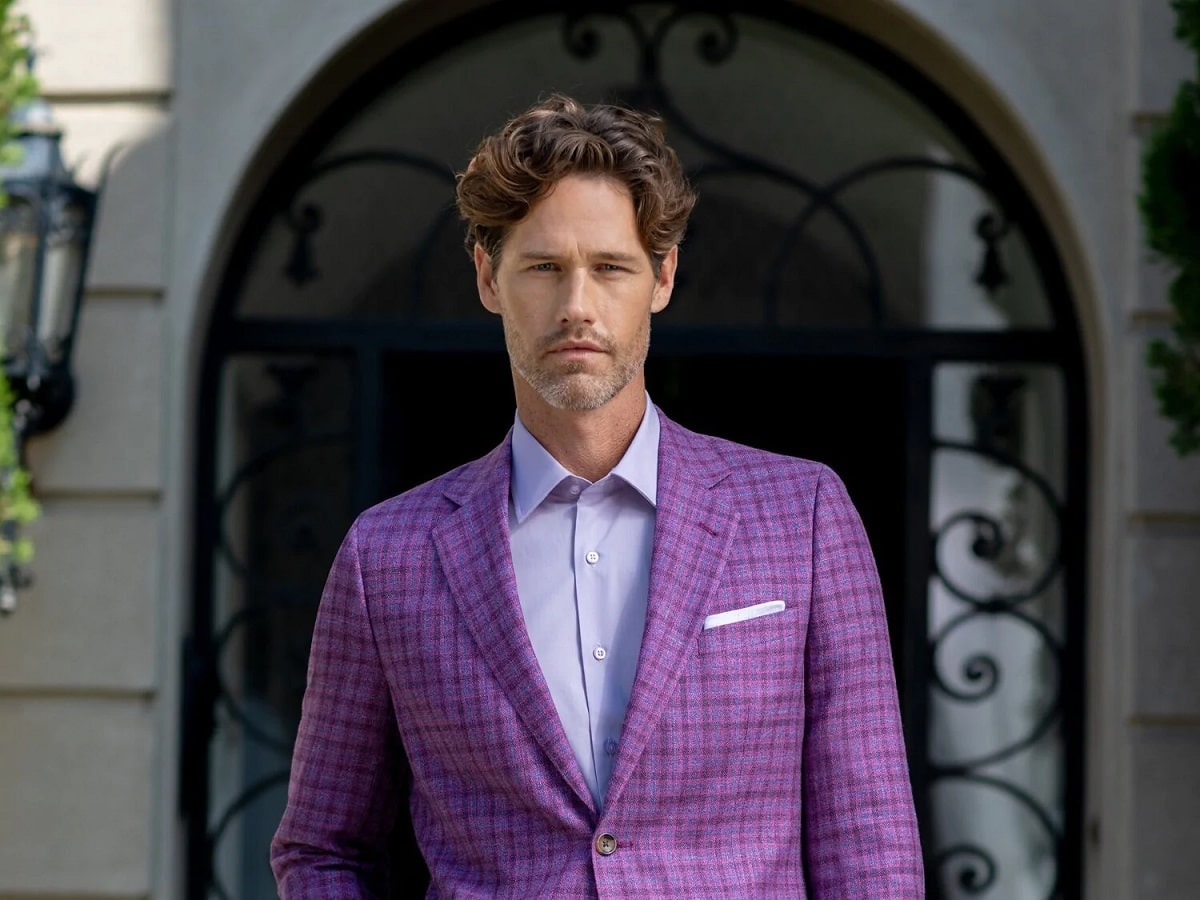
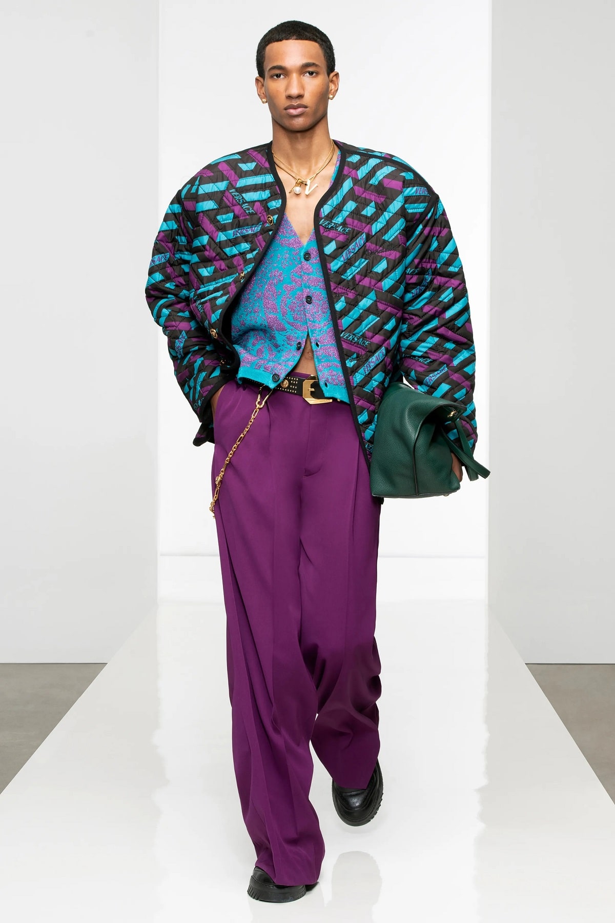
When we think of multipurpose, adaptable colours, we immediately picture neutrals. You see some charcoal, perhaps lightened to a solid grey, or imagine the possibilities of navy. Branching off from here, blues and greens go nearly the same distance, perhaps just tweaked slightly for the weather. For autumn 2022, brands appear to be making a similar case for purple. Nearly always, except for in the context of burgundy, we group purple in with statement colours. Most might say it’s too much of something: It’s dark but with too much warmth, pastel but with too much of a cool base tone, and too bright and loud, once it edges toward the pink-flecked realm of fuchsia. At the same time, even in the increasing fluidity of menswear silhouettes, it gets shamed for appearing too feminine. Yet, purple has crept up on us, indirectly through 2020’s obsession with mauve and over a few years' time through the omnipresence-to-the-point-of-mundanity pastels. We also tend to make justifications, in terms of suiting, for burgundy: It’s a jewel tone, you claim, and it’s mostly red, offering an acceptable dose of masculine boldness. Whether or not you embrace it, purple in varying forms is inescapable for the time being:
What’s Predicted
The harbinger of this whole low-key purple fascination started off with Pantone, which predicted Very Peri as the Colour of the Year after looking at SS22 and AW22 Fashion Week presentations. Illustrating its role as a bridge between cooler and warmer tones, Very Peri stands upon a powder blue foundation while mixing in touches of red. You spot the not-too-intense depth, and also note its possibilities, including how effortlessly Very Peri meshes with greys and charcoal, blue tones, darker reds, and even tan and brown. At the same time, Very Peri simply encapsulates broader shifts in terms of how we perceive purple. Sprinkled throughout collections and deeper presentations are darker, almost black hues like aubergine and pansy that, particularly in the context of suiting, shake up the boundary we’ve made between formal, classic, and, dare we say, “proper” construction and a “party” or cocktail dress-appropriate option.
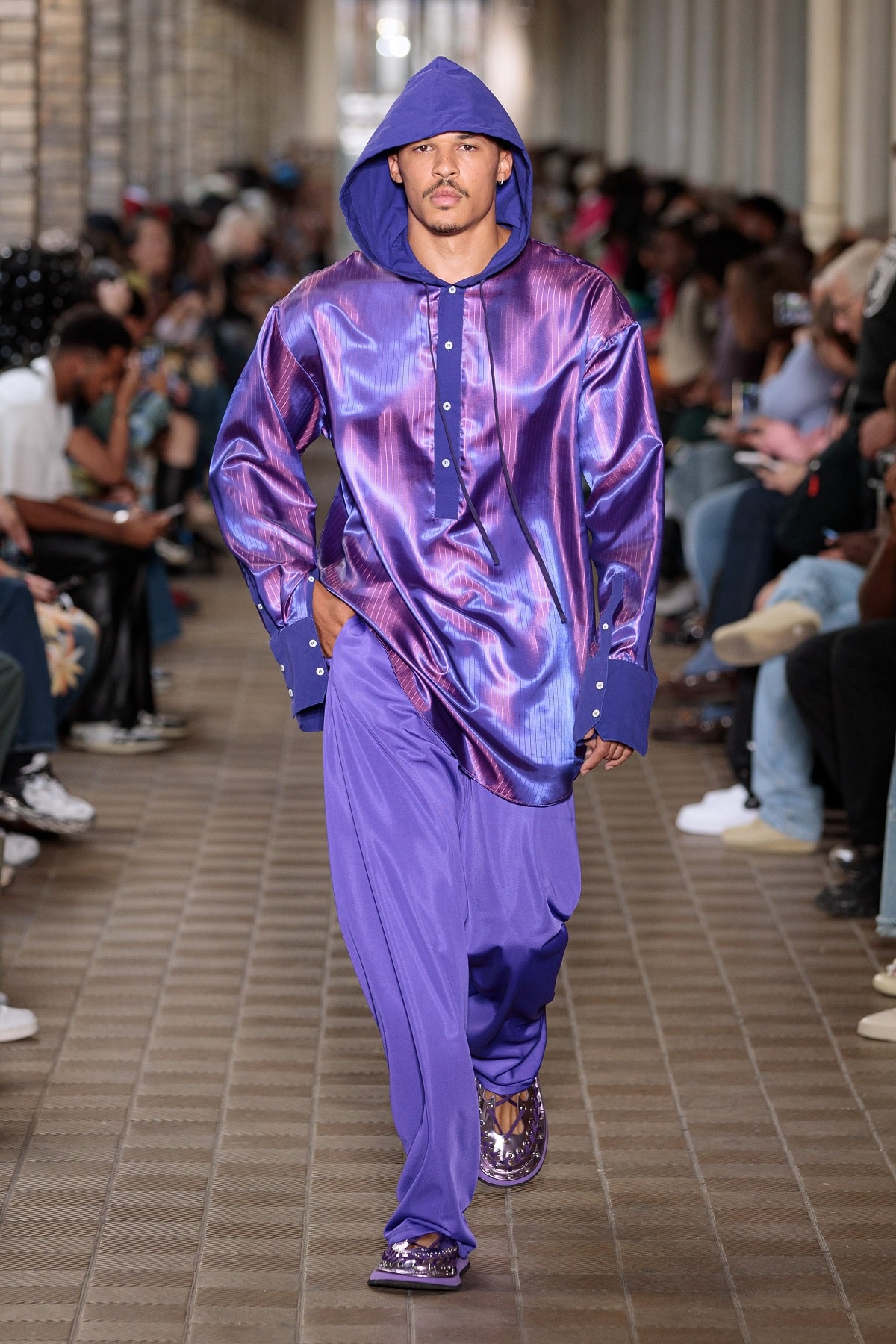
It’s intense, it’s only somewhat flashy, and incredibly vibrant while also seeming restrained. As the corollary to this, purple exists across a spectrum. Opposite to aubergine and more royal variations sits mauve and lavender – light, almost spring like, and unabashed with their feminine undertones. They’re a pale cousin to Millennial pink mixed with a hint of blue for palatability, and often given a dusty, darker makeover that plays off emerald greens and even turquoise. Somewhere hovering above yet still within the spectrum’s orbit exists more exuberant variations – think the shock of electric lavender or the neon concentration of fuchsia. No one would dare group them in with the darker neutrals or the staid pastels, and their purpose is strictly to draw and hold your attention.
Why We’re Suddenly Paying Attention to Purple
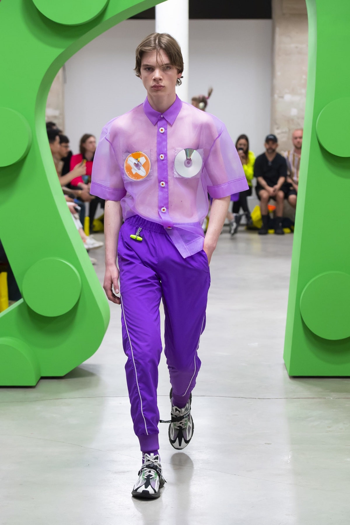
It Has Range: We’re approaching trends with more discernment in the present time. Does something have more longevity? Will I be able to wear it past one season? With purple, you can answer “yes” to both. While the shock-driven collections remain – think that solid fuchsia theme from Valentino’s AW22 ready-to-wear presentation – purple’s getting the treatment pastels started receiving about four years ago. Ultimately, your wardrobe doesn’t have to stick to greys and blues, and other shades are being pulled into the same neutral sphere.
The Shock Value: Thinking back to the late ‘90s and early ‘00s, the emergence of pink as a colour men could wear seemed daring, if not a message of multi-level defiance, during an era of baggy jeans and frosted tips. A Y2K revival has already taken over these early years of the 2020s, yet pink feels incredibly mundane 20 years in. Purple appears new and equally as adventurous: Beyond Valentino’s vibrant monochrome ensembles, that Louis Vuitton paint can bag, conceptualized by the late Virgil Abloh, infuses the shade with the hype factor.
Universalism and Versatility: We’ve mischaracterized purple as a spring shade, perhaps picturing it among florals or pastel-toned like an Easter egg. Current offerings reveal its four-season possibilities, be it the necessary depth and darkness to play off charcoal for autumn and winter, and the effervescence, particularly through a lighter, textured fabric, that captures spring and summer’s sense of renewal and possibility. To this end, purple isn’t just something infusing a print, woven into a pattern, or relegated to monochrome-only ensembles due to its sense of oddity. Rather, it makes an adaptable colour-blocking shade: cool enough to contrast against warmer tones like red or yellow, with sufficient depth to hold its own against blues and neutrals, and restrained to the point that you can pair it with something like tan or green. In short, it breaks up predictability and by-the-numbers dressing without rerouting familiar terrain or pushing you too far to try something new.

Trending
2
3
4
5
6
7
8
9
10


