1
HOME > Tips & Advice >
HOW TO MIX AND MATCH PATTERNS IN MENSWEAR
Written by Ivan Yaskey in Tips & Advice on the 10th March 2022
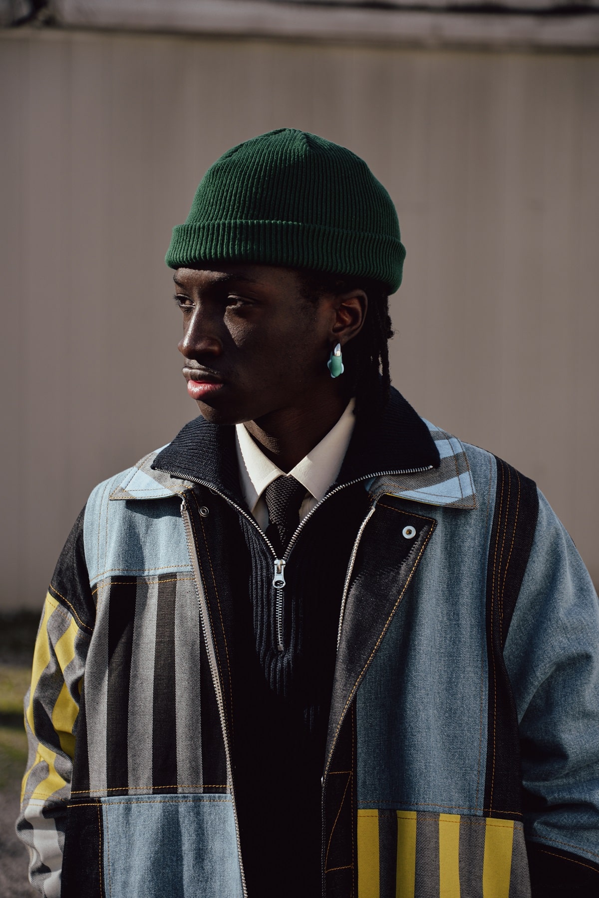
We all have heard this supposed rule at least once during our lives: Don’t mix prints. Plaid and checkerboard look ridiculous together, leopard print needs room to breathe, and florals are equally as complicated. But, as much as menswear muses a return-to-basics image, the counterpart – and perhaps more pervasive side – is maximalism: large prints, wide silhouettes, and bright colours. In this direction, pattern mixing – or clashing, as some still call it – starts to not only seem modest but expected. After all, with your wardrobe containing a growing number of such pieces, you can’t just keep pairing them with the solids you own. Still, mixing and matching prints has potential to go so very, very wrong. While prints and patterns add oomph like the right ingredient in a recipe, it’s definitely possible to end up with too much of a good thing or, worse, something visually vile. Instead of just throwing two patterned garments together, consider some of these guidelines:
Colour Commonalities
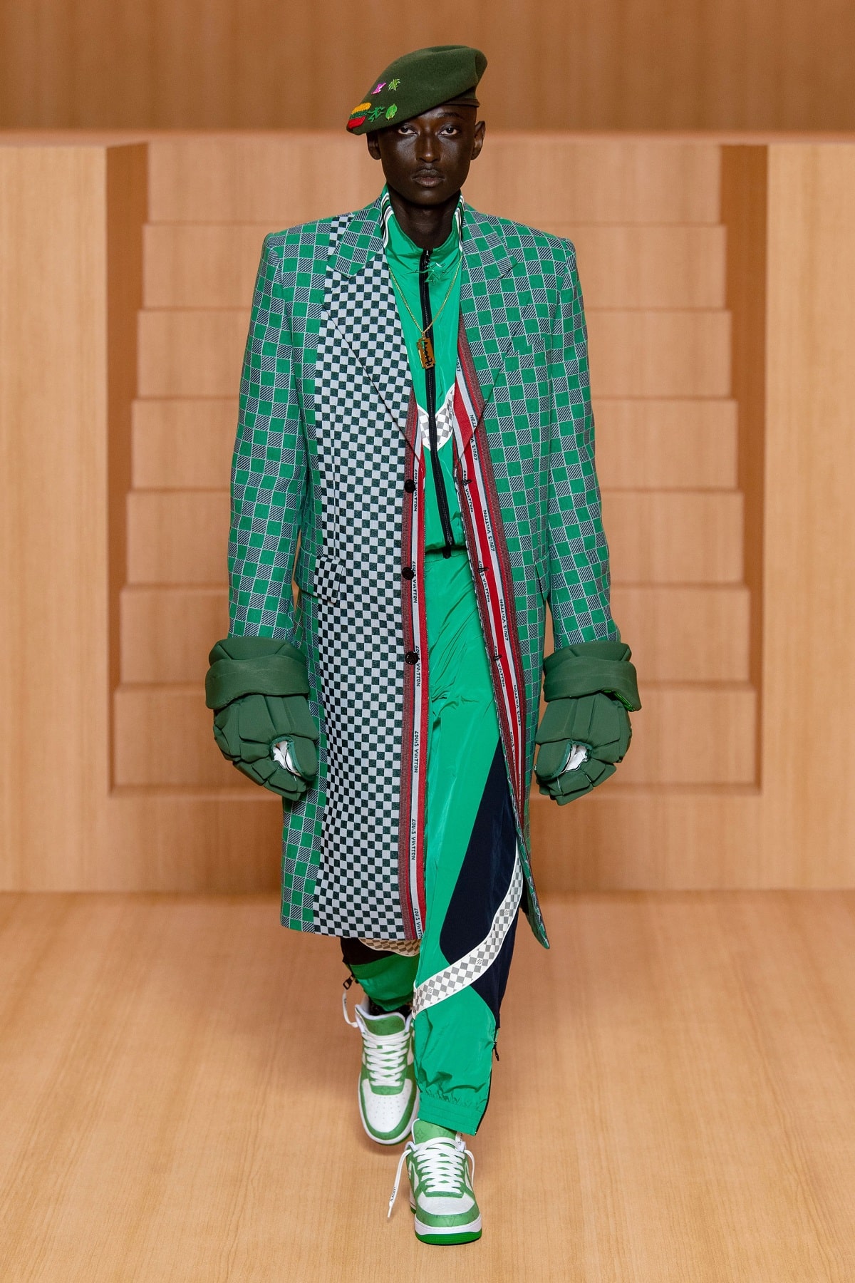
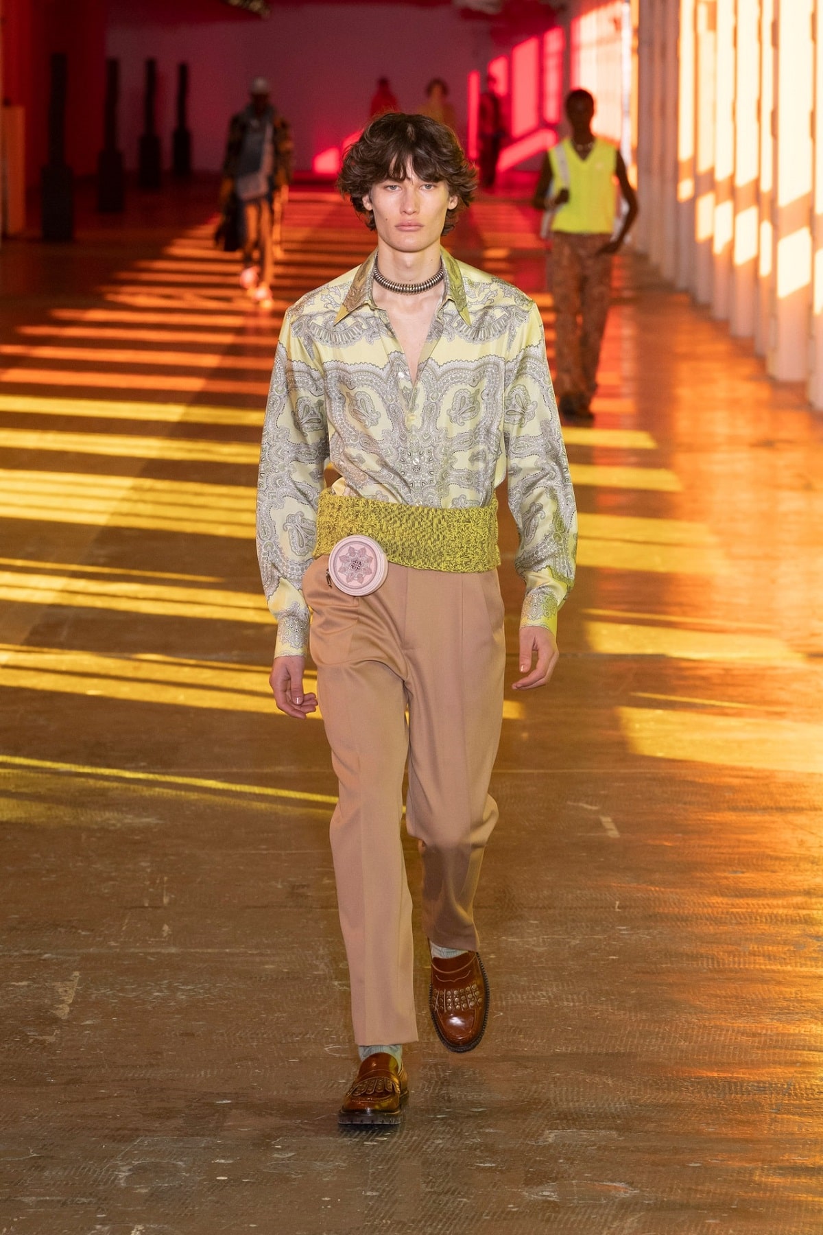
This is old-school pattern-clashing advice but a solid – no pun intended – place to begin. Starting with and going beyond dress shirt and tie combinations, search for a similarity between the prints you’re pairing. An identical colour is often a good way to start, or pair matching colour schemes: for instance, two black-and-white-based patterns, like beach chair stripes and silhouette florals. As a more complicated and subsequently elevated version, look for patterns sourced from similar colour groupings or spectrums: for instance, two cool-tone combinations hovering around the blue-green-brown-turquoise range. As a third factor, examine the prints or patterns in relation to each other: even with fluidity among colours, one plays more of a secondary role to the other. Thus, opt for something two-tone or monochromatic – stripes, windowpane checks, or polka dots, for a few common options – with something more involved and complicated, like detailed florals, a landscape, or magazine print.
Break It Up
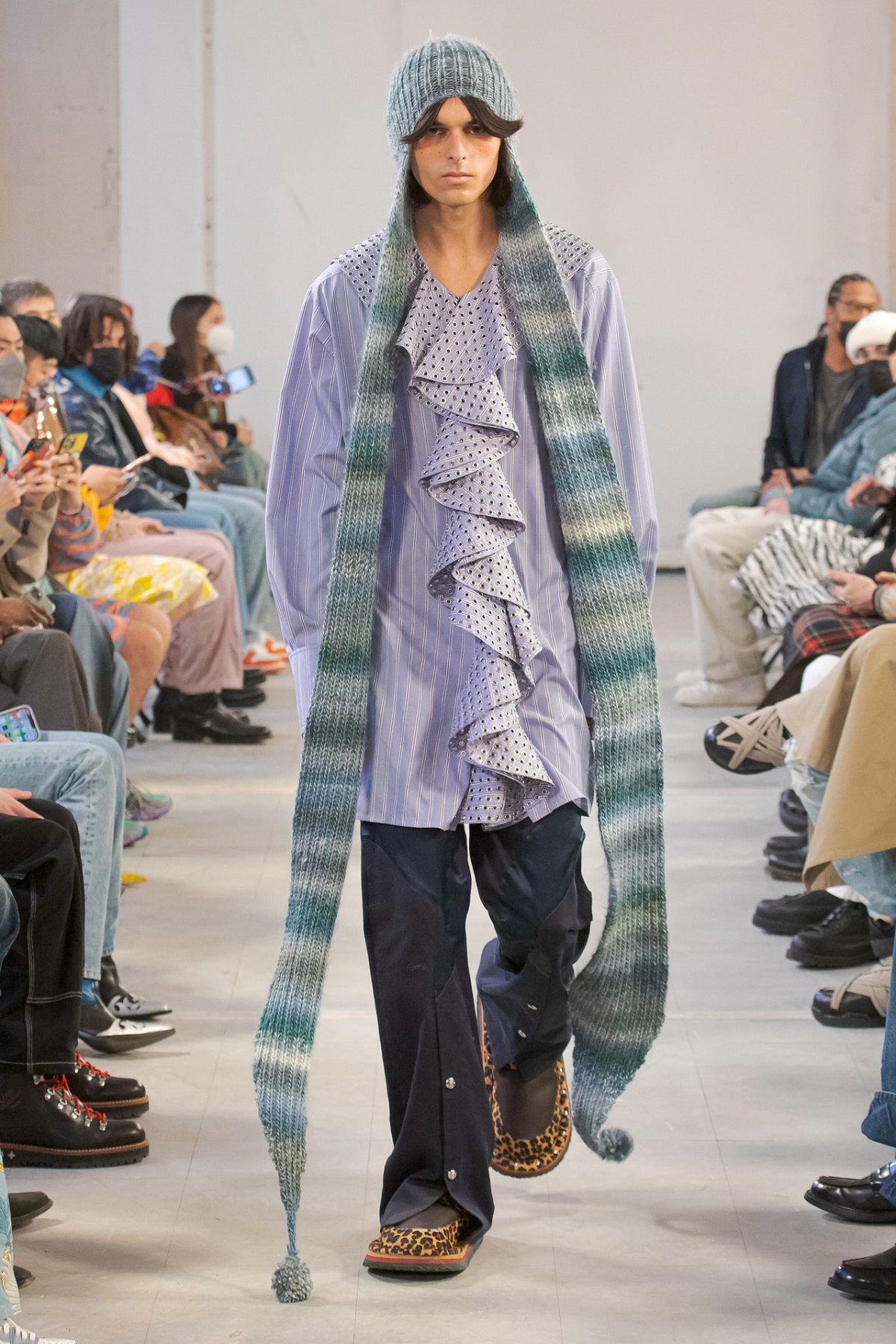
Going back to the food analogy, sometimes you need a palate cleanser, like the ginger paired with your sushi. That, here, is the incorporation and, more specifically, the boundaries created by solid-colour garments and accessories with your patterns. This isn’t to say you can’t wear head-to-toe prints. Yet, when you’re dealing with a potentially overpowering combination, mixing it with a few solids has a muting effect. You have a handful of choices here. Keep the patterns and prints relegated to a few accessories: In the menswear realm, you spot this with patterned pocket squares and ties against a solid-colour suit and dress shirt ensemble. More creatively, add the pattern to your shirt and trousers, but reduce their intensity with a solid-colour neutral blazer on top and belt in between. Along with this strategy, think about how the pattern or print materialises. Not everything has to have heavy contrasts, and embodying this approach are monochrome and embossed fabrics – basically, the pattern emerges in certain lights – and textured materials. Consider pairing this understated yet not truly solid combination with something bolder and more saturated.
Size and Structure
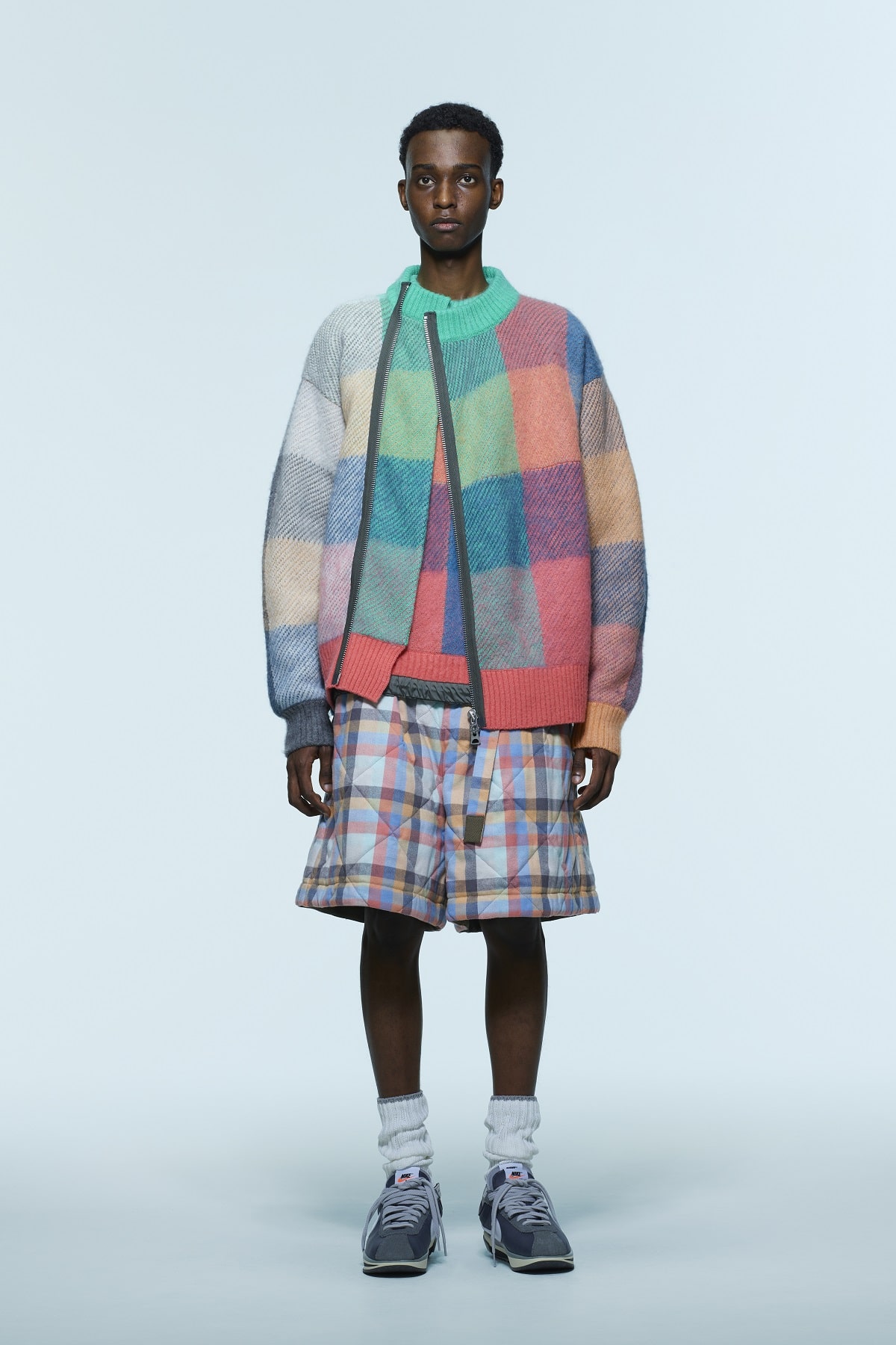
The quickest way to oversaturation when it comes to prints and patterns is keeping everything at the same scale. You can see this both with a head-to-toe maximal print: think a bold floral suit in the vein of Harry Styles without a solid-colour shirt underneath to break it up. Although a smaller scale might appear more modest, you essentially end up with a dithered effect, like what digital camouflage creates. It’s not solid, it’s not quite a print, and it feels fully like uncertainty. Instead, as we started seeing with stripes a few seasons ago, size and direction matter. This principle now goes beyond to other combinations, making it possible (and not visually jarring) to mix florals and plaids. What does this look like? Keeping in mind the rules of colours described above, this effect breaks up your look by using the same type of print in different sizes and angles. With stripes, this might be a mix of Breton, beach chair, and pinstripes at right and every other orientation in between within the same spectrum of shades. Plaid presents more possibilities, from playing the more vibrant tartan off starker windowpane checks to adding contrasts with buffalo. With florals, this might look like pairing something shabby chic off a silhouette or micro-print.
When In Doubt, Take It Off
You’ve got a couple of choices here. One, if you find yourself uncomfortable or uneasy with patterns, begin small without altering the core areas of your ensemble – your shirt, trousers, and jacket. Unlike the scenarios described above, you might want to experiment with a pocket square contrasting against a tie in a different print but related colour scheme. Or, on a casual basis, play around with your socks and belt while keeping within a more classic foundation. Or, as one increasing tip, a pattern or print on the outside – via a jacket or blazer – delivers a greater degree of experimentation with some flexibility in mind. Specifically, the print, perhaps contrasting against a more subtle shirt or scarf, goes right for impact without question. Yet, especially if you’re headed somewhere indoors, you know you’re not stuck with this combination, and simply taking off the jacket immediately tones down the intensity.

Trending
2
3
4
5
6
7
8
9
10


