1
HOME > Essentials >
6 WARDROBE-ESSENTIAL MENSWEAR PRINTS
Written by Ivan Yaskey in Essentials on the 17th August 2020
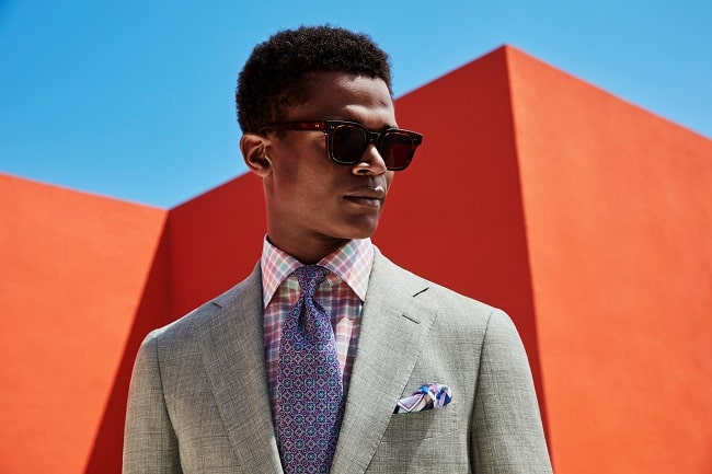
Supporters of true minimalist menswear will proclaim that prints are superfluous. Any man should be able to get by on solids, preferably in neutral shades. But, seriously, where’s the fun in that? And, considering the pace at which menswear has progressed over the past 15 years, you’re missing out. Yes, you’re following classic style to a T, but it’s also a tad ascetic. To use a food metaphor, it’s all meat and potatoes. You get nourished and feel full, but a slice of pineapple, a cutup bell pepper, and even the occasional piece of cake adds some variety and breaks up the day-to-day starchy, protein-heavy monotony. So, your navy chinos and your blue shirts get you through and deliver a foundation that lasts far longer than the latest trend. But, from here into similar grey, white, and tan garments, you’ve developed a comfortable but too-cloistered spectrum. You have to venture out. A bright solid shade is the first step. Then, it’s onto prints.
Yet not all prints are equal. The explosion of patterns occurring over the past five years has led to a plethora of options that stick around for a season or two. They’re often not worth the investment. Then, there’s the print that looks edgy and has a little more longevity but isn’t always practical for the workplace. Think camo, paisley, or a geometric combination. As the third and most versatile option, certain patterns have developed more staying power, where they’ve outlasted their novelty days and deserve regular rotation. Here’s where you’ll spot a few of these essentials:
Vertical Stripes
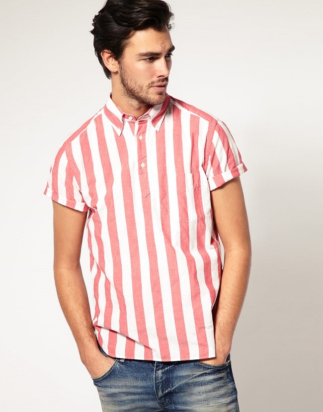
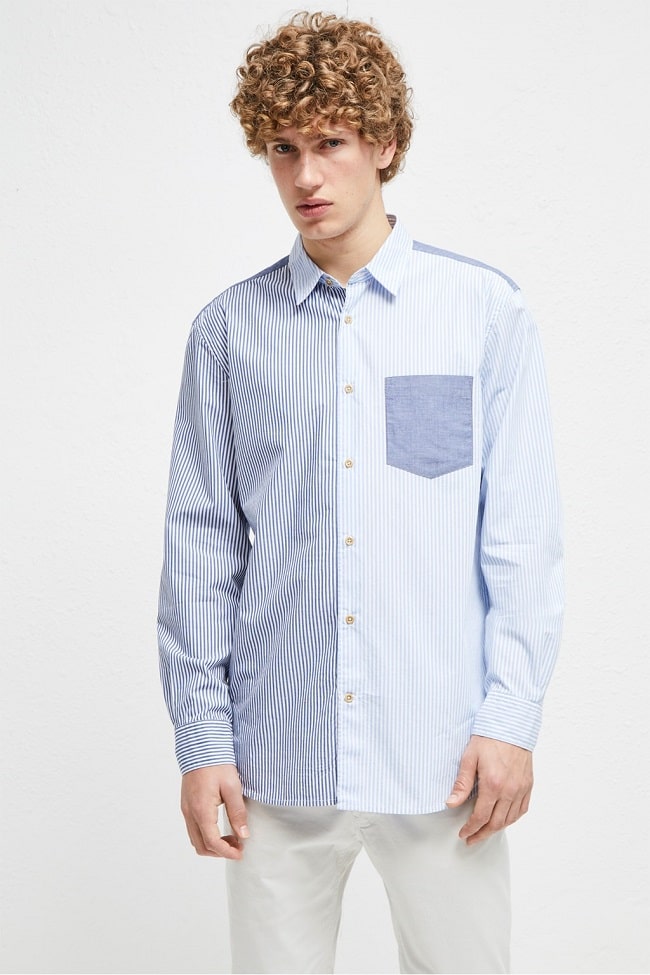
For a foundational wardrobe, “Solids or stripes?” should be something you regularly ask yourself. Vertical stripes tend to have an edge over their horizontal (or diagonal, if you’re truly being up to date) counterparts. One, it’s a known effect that this pattern lengthens the torso – a plus for anyone who’s shorter than average or a bit stocky. Two, vertical stripes tend to be a preppy basic: It’s the default pattern for seersucker, and J. Crew and Brooks Brothers have made micro- and medium-width stripes a key part of their respective product lineups. Third, more in a modern context, room for variation exists, whether it’s uneven widths, wider beach chair stripes, or, in the opposite direction, pinstripes. For an essential, though, those multi-tone candy stripes might lose their taste in a few years. Instead, look more toward a medium-width two-tone pattern, or classic pinstripes.
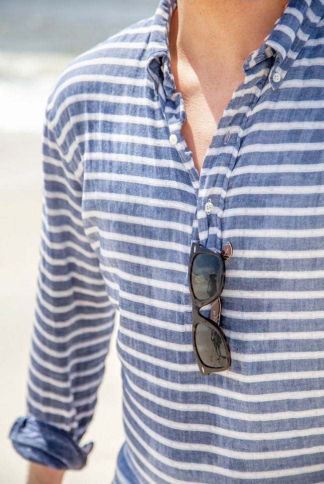
Horizontal Stripes
Horizontal stripes tend to come in second place to their vertical counterparts. Even with narrow widths, they make the torso appear wider or highlight unflattering areas. As well, thicker stripes still give off Freddie Krueger vibes, are reminiscent of older prison uniforms, or look like something that belongs in a ski lodge. With these assumptions aside, horizontal stripes with the right cut and ratio give off effortless, classic style – think the Breton or nautical stripe, in white and navy in unequal widths. Or, it’s an unexpected take on pinstripes, where the reversed classic pattern breaks up a solid-colour shirt. For a versatile, timeless interpretation, keep the stripes narrow, or alternate wide and narrow widths, and avoid brash contrasts. A dusty navy and off-white or white and grey blend better together than the dithered appearance of stark white and solid black.
Florals
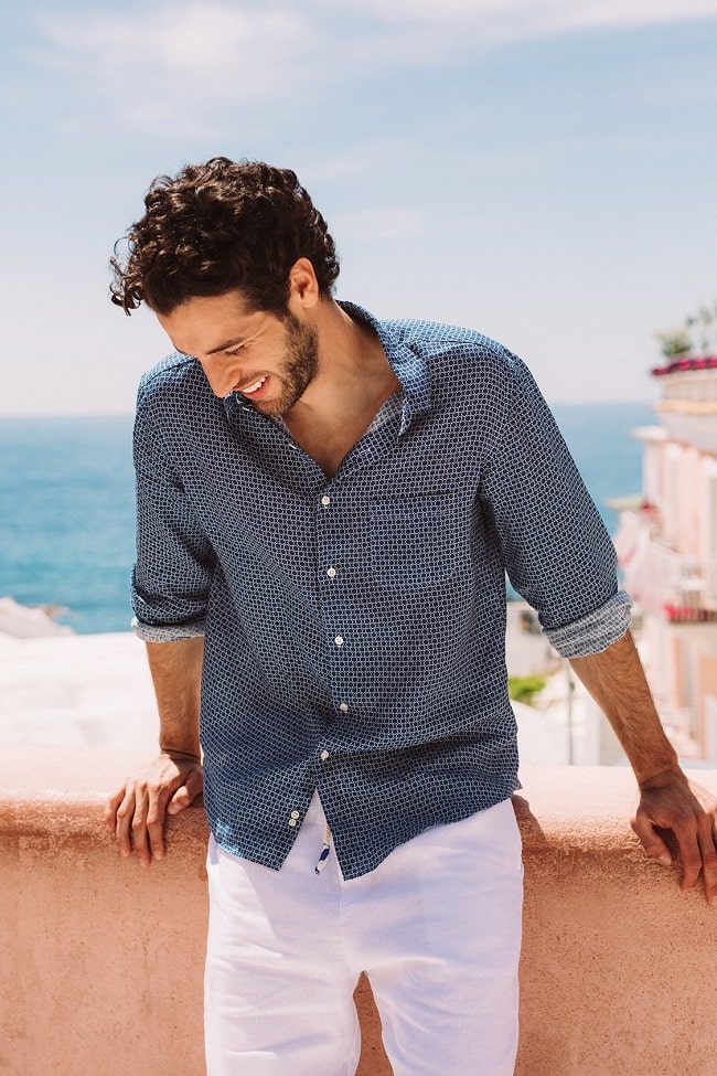
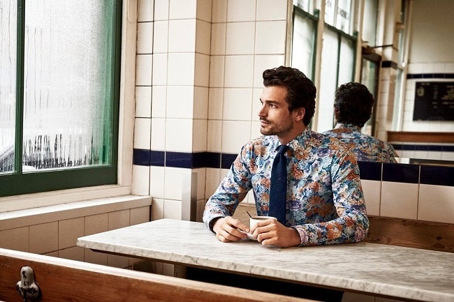
20 years ago, no one would have predicted the floral shirt (or any floral print, for that matter) would’ve become a staple menswear item. Although certain combinations like oversized and tropical prints have offered a few variations, florals are the perfect embodiment of masculine’s inherent feminine side without, in most cases, resorting directly to pink. Florals can exist strictly within the dark, smoky realm of black and grey, provide a unique take on navy, and bring in colours without being too much of one shade. All that said, the formula for a longer-lasting floral print often comes down to size and colour. Smaller and medium sizes never hit you in the face, and while colour is certainly an asset, you have to be strategic. Look for prints that don’t draw in too many shades. Contrasts should be handled with just as much care: for a clear black-and-white mix, a silhouette print is preferred. Otherwise, the starkness detracts from the print’s overall details.
Plaid
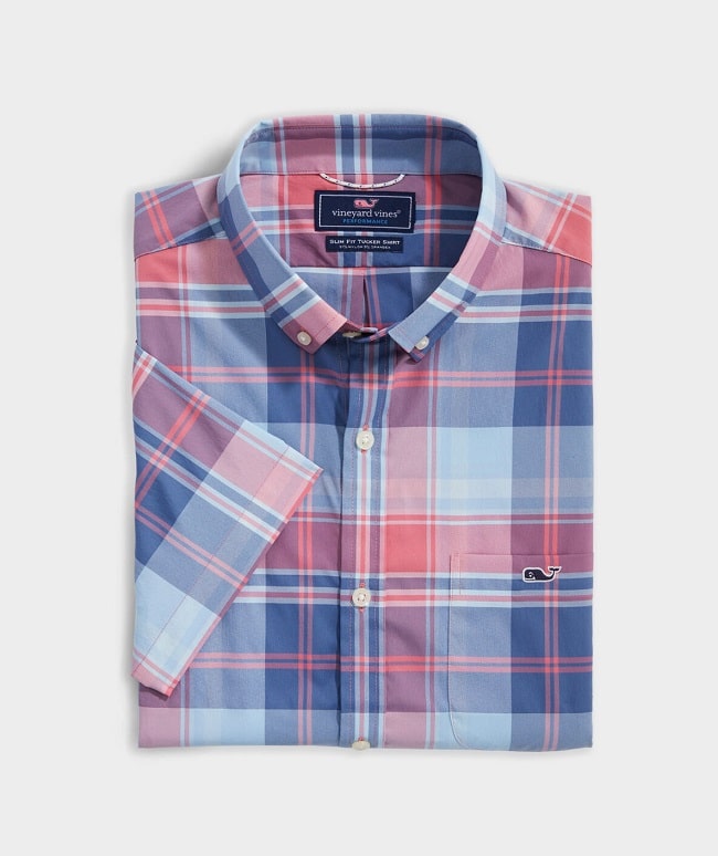
Plaid occupies the same space in the menswear world as vertical stripes: It’s a pervasive pattern that’s been around for decades, has carved out its own corner in the shirting market, and proves it works for full-on suits as well as trousers. Yet, the question is no longer, “Should I wear plaid?” but instead, which kind? Tartan, buffalo checks, gingham, tattersall, and even madras open the door to all sorts of possibilities. Today, tartan and tattersall, in cool to neutral colourways, represent a solid, if slightly unexceptional, baseline that’s always good to go with denim or chinos. Buffalo and gingham, meanwhile, travel the same path in different sizes, while madras checks prove that yellow, green, pink, and teal work together surprisingly well when woven into the same material.
Windowpane
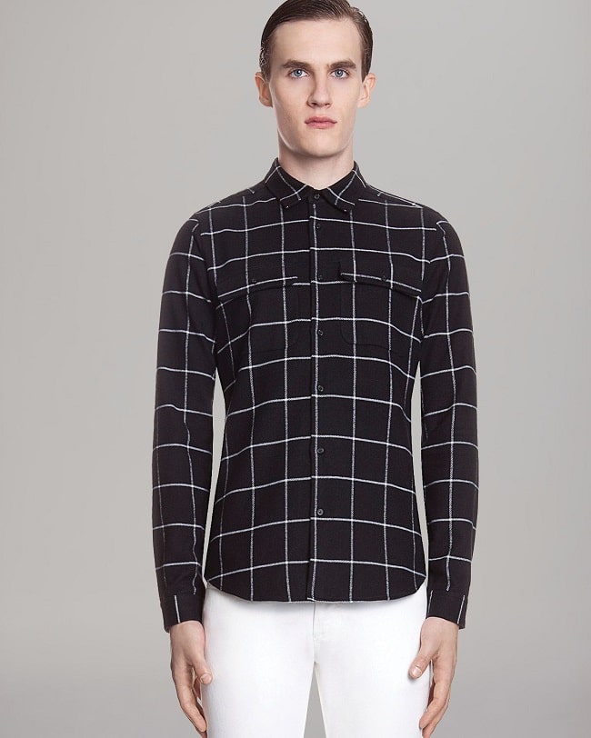
Purists will stand by the notion that windowpane is just another plaid. Yet, the division – and why we’re separating both here – is in the execution. Plaid prints in the most casual sense contain at least two thread colours that overlap in such a way to result in additional tonal variations. Windowpane doesn’t really do this, except for the small square in the crosshairs. Rather, windowpane presents a more sophisticated and versatile interpretation of a geometric print. It’s a grid on a large scale. Its angular precision looks like a series of blocks someone carefully arranged. And even when you have overlapping windowpane checks, that just adds to the mathematical aspect, partitioning the larger squares into smaller portions. Other geometric prints have yet to gain this degree of staying power.
Colour-Blocking
There’s the argument that colour-blocking isn’t a pattern, either. But, as we’ve seen, symmetry and order can exist – it’s not simply colouring the arms a different shade from the body and calling it a day. But colour-blocking is another combination that either keeps things classic or ventures too far into novelty territory. As a tip, look for three shades at most, with clean lines and a balanced, proportional design.

Trending
2
3
4
5
6
7
8
9
10


