1
HOME > Tips & Advice >
THE DOS AND DON’TS OF MIXING PRINTS
Written by Ivan Yaskey in Tips & Advice on the 13th November 2019

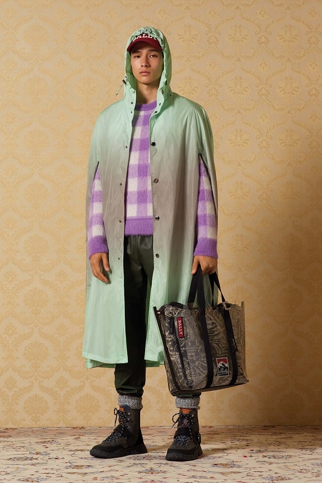
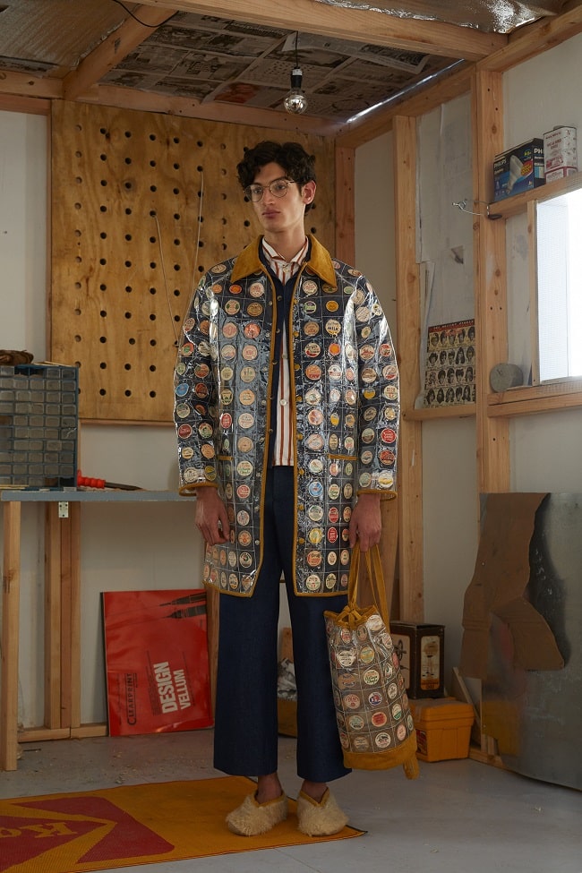
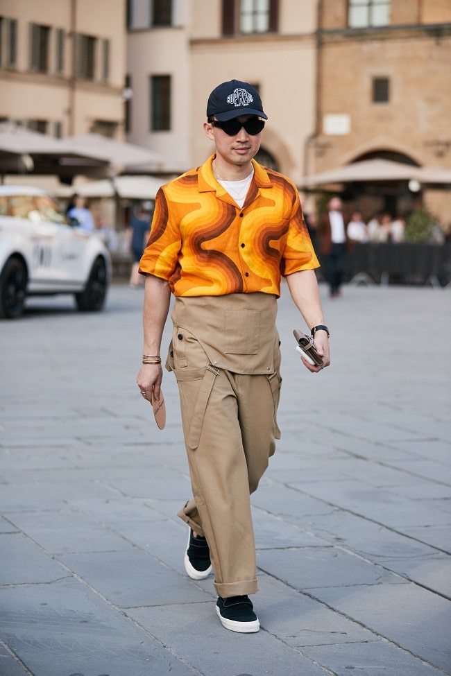
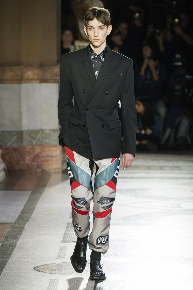
Can you count how many times you’ve heard, “Don’t mix plaid and stripes”? What about, “Florals and paisley just don’t go together”? For decades, the rules concerning prints and patterns were relatively clear and straightforward: Stick with one, and always pair it with complementing solids. Those hard-held assumptions started to transform roughly a decade ago, with the whole power-clashing concept. However, mixing prints extends beyond the boardroom – and those at the top corporate echelon. Instead, as we’ve seen in more recent runway collections, the average guy has far more options, and trying out a few prints – even at the same time – is less frowned upon than it used to be. The key here is knowing how to match seemingly contrasting, contradictory prints. Here’s how you can get started:
Patterns Shouldn’t Ever Compete for Attention
Or, to put it more literally, don’t ever pair a statement print with another statement print. It’s like watching a wrestling match between two heels. While no single print type is 100-percent statement, they all share some characteristics. Bright, bold colours compose much of its design. As well, it’s frequently on a larger scale. Third, it’s especially contrast heavy, and as a fourth but not always absolute aspect, you’ll find it on a shiny, sheer, or textured material – think silk, twill, or rayon. Within this realm, a Hawaiian-printed rayon shirt, a fuzzy leopard print jacket, a nautical striped sweater, wool Tweed blazer with windowpane checks, and a buffalo print flannel all have statement appeal.

Thus, in mixing prints, don’t pair two or three of these options together. Instead, match the loud with the subdued. In this case, the print is tonal based, smaller in size, generally a classic combination, and added to a cotton blend. For some examples, think microstripes, herringbone, smaller-size checks, or even pinstripes. As a good rule of thumb, you shouldn’t always be able to spot a subdued print from a distance, and in fact, the fabric might deceptively look like a solid shade. In the process, avoid combining hard, angular lines with each other. Instead, mix this type of print with something made up of rounded, softer edges. At the same time, always keep the statement print on the outside, and in layering, add the smaller, lighter print inside – think of how you’d wear a blazer with a button-up shirt, or a bomber over a T-shirt or sweater.

Look for Similar Colours
Regardless of which patterns you select, there should be some kind of common ground. Colours are the quickest and easiest pathway. Shades here shouldn’t simply flatter each other; rather, look for one or two of the same colours to tie it all together. If, for instance, you spot a tinge of turquoise or yellow in a floral pattern, any matching microstripes ought to incorporate at least one, if not both, colours. On that note, lean your palette in more of a neutral direction, rather than strictly resting or depending on bold hues, and stay within the same colour grouping – for instance, all cool blues and greens or an array of browns and tans. As another rule of thumb, the patterns you use should collectively have no more than three shades total. Anything beyond seems too busy, overdone, and chaotic.

Vary the Pattern Size and Direction
On this note, even if you stick with two similar patterns – for instance, gingham and buffalo checks – avoid two similar-sized combinations. Especially within the same colour grouping, the result heavily comes off as matchy-matchy. Rather, within the statement-subdued dichotomy, aim to keep one pattern smaller sized – whichever comes in the most neutral or tonal mix – and one noticeably larger. Here, too, avoid keeping it all in a single direction. Especially where stripes are concerned but applicable in several other instances, change up the angle – vertical, horizontal, and all other directions in between.

Know Which Patterns Complement Each Other
Stripes and stripes, and checks with checks - in line with all rules above - are relatively logical pairings. But, what about mixing dissimilar patterns? Here’s where that angular-versus-soft rule comes into play: In this case, find some commonality besides colour – such as size or direction – and seek out contrasting edges. For instance, polka dots smooth out houndstooth, florals and geometric configurations play off each other, paisley adds some whimsy to herringbone, and stripes partially streamline ikat and similarly angular-based prints.

Separate Your Prints with a Solid
As they say, begin with baby steps. If a print on top of another print seems too jarring – and for the uninitiated, it will definitely feel that way – create a clear and literally solid boundary – for instance, by wearing a solid-colour blazer with a patterned button-down and a contrasting printed pocket square. Follow all rules listed above – especially in terms of common, connecting colours – but separating both prints into distinct corners of your look acclimates you to the concept. Soon, it won’t look or feel as odd, and that boundary will get blurred – or removed entirely.


Trending
2
3
4
5
6
7
8
9
10


