1
HOME > Trends >
TOP 6 TRENDING MENSWEAR PRINTS FOR SS18
THIS SEASON’S ALL ABOUT LARGER PROPORTIONS, A FONDNESS FOR POP ART AND RETRO-STYLE
Written by Ivan Yaskey in Trends on the 27th June 2018
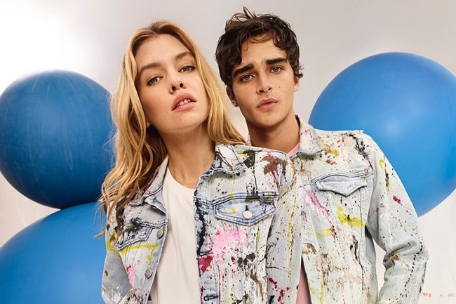
If Spring/Summer 2018’s approach to patterns could be summed up in one phrase, it’s this: We’re through with them, but love them to extremes. It’s a paradox right on its face, but simultaneously encompasses monochrome’s swift arrival and prints pushed to the edge. We’re beyond thinking paisley’s innovative; instead this season’s about larger proportions, flipping things around, and a fondness for pop art and retro-styled combinations.
Orient Prints
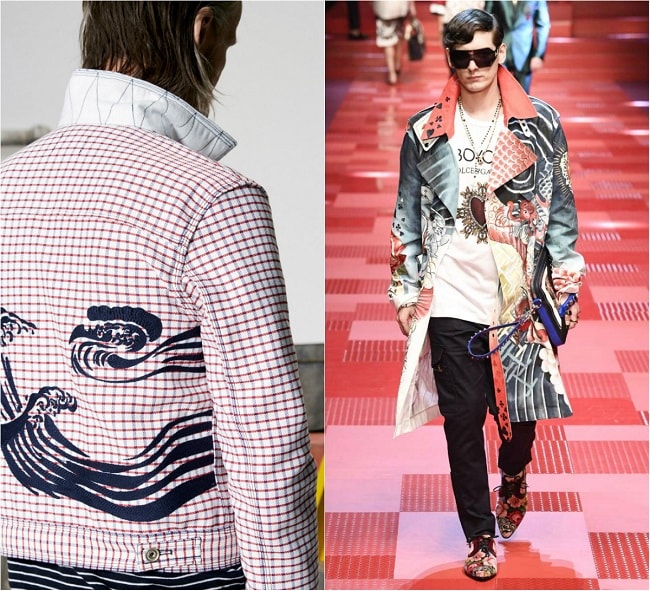
We live in an era where critics and social media users loosely toss around “cultural appropriation” accusations. Most of the time, it’s warranted. At others, it’s just empty fodder for an SJW-leaning piece about takeout food. So, considering this, the emergence of what’s being called Orient prints looks like a misstep – an oddity soon to follow a bunch of online grandstanding and brands taking down lookbooks. Yet, the imagery – of carps, samurai, geishas, and Rising Sun symbolism – organically emerges from two sources. More obviously, the souvenir jacket introduced this concept in retro, military-leaning packaging just two years back. The extension, then, comes off as a clear path from silk jackets to cotton shirts. Less obvious? The return of early ‘00s styles. That era’s Hawaiian and bowler shirts dabbled with such imagery – from the ubiquitous Chinese characters to anime graphics. This time around, the cheesiness and disco revival vibe are out, replaced by refined, artwork-like patterns.
Hawaiian Prints
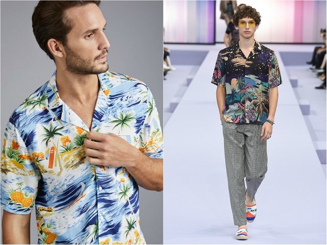
Given fashion’s 20-year cycle, Hawaiian prints rightfully have returned into rotation as a late ‘90s throwback. Or, factoring in last year’s stealthy ‘70s emergence, the bold floral and island-inspired patterns look like a product of that decade, especially when worn on a camp collar silhouette. But, the vintage façade isn’t meant to resemble your grandparents’ cruise clothes. Rather, the aesthetic – silhouetted but dark and frequently detailed – fits in with any modern-day cruise lookbook – a fashionable, if not streetwear-influenced, bent on a designer’s more high-end looks. Gucci and Balmain, right now, have established the paradigm. Yet, through whichever lens you choose, the updated Hawaiian print sheds off its garish, frequently tacky past for depth and directness. Saturated hues are less of an eyesore, and all the busyness seen even two decades ago gets traded in for repeating or all-over floral prints. Keep the material light, and the print complex but understated.
Magnified Prints
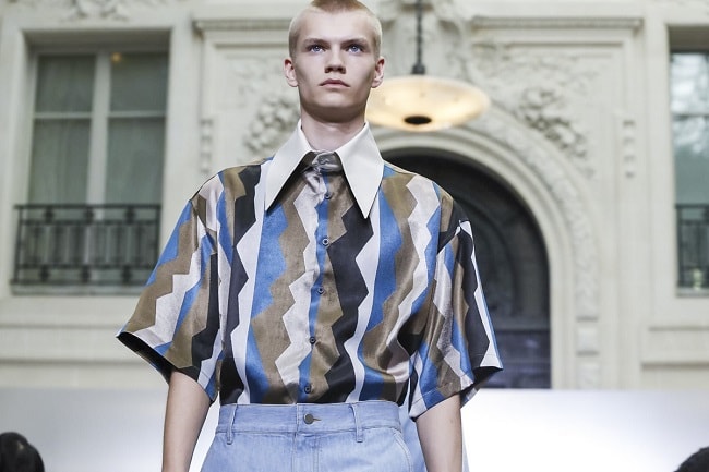
It’s stating the obvious: Trends get stale. Prints we’ve all kicked around for a few years – florals, geometrics, and even stripes – all hit that proverbial wall where there’s nowhere to go but fade out. Or, is there? If you’ve got to go big or go home, you might as well attempt a swing at the former. The magnified print capitalizes on the concept of recycling something well-worn, and giving it a new perspective in the process. Flowers in bloom take up more space on your button-down shirt, tile-like geometric prints now come off like a giant game of Tetris, and horizontal stripes toe the line of full-on color-blocking.
Splatter Prints
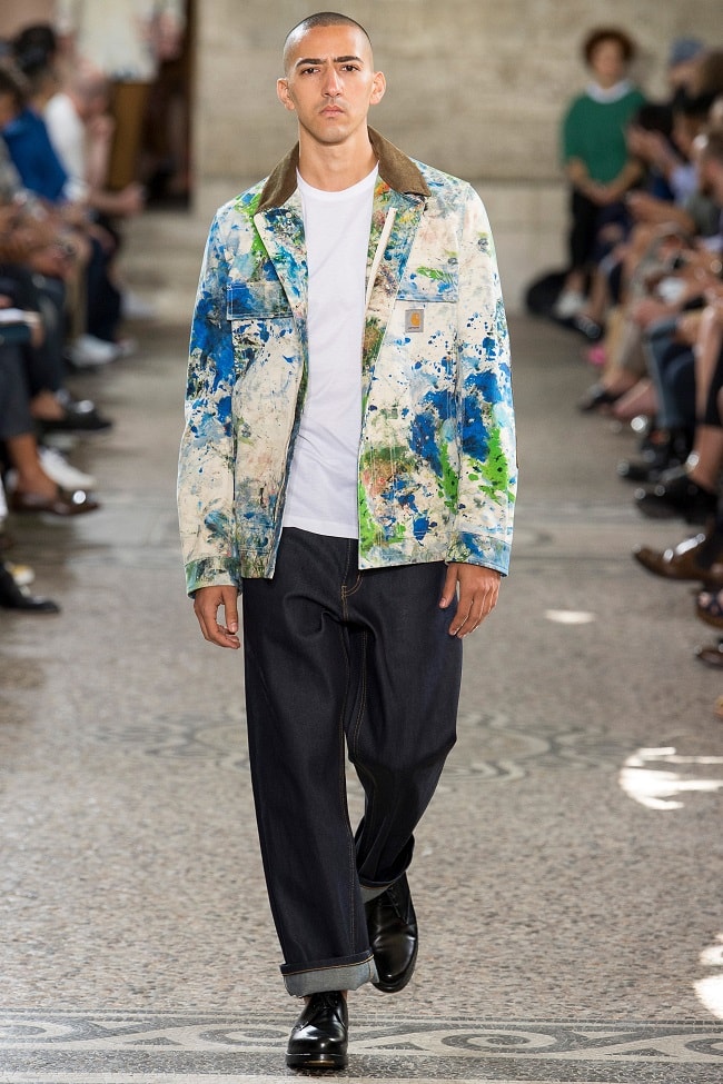
You’d be right in thinking this: The splatter print isn’t entirely new. A low-end denim trend in the late ‘80s, its haphazard appearance snuck back in last year with bleach-splattered jeans. In Asian streetwear, tees, hoodies, and even button-downs began sporting bright splattered patterns around the same time. None of this approaches much of a concept beyond recycled second-tier style choices. For SS18, designers have given it a more thought-out spin. Junya Watanabe, for starters, took that workwear wave he’s been riding, and brought it to the jobsite. What we get are Carhartt jackets covered at least partially with asymmetrical blotches and resembling cotton duck garments covered with the remnants of painting a mural. With just as convincing of a story, Yohji Yamamoto starts with a surface-y concept: Tokyo-esque fashion brought to the masses at Fashion Week. Yet, the paint-covered suits represent something more: Taking a particularly high-end, sophisticated, if not classic piece and literally reconstructing it as streetwear.
Contrasting Vertical Stripes
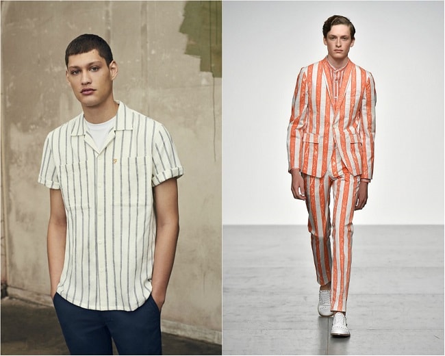
London Fashion Week hinted at another stylistic turning point: Designers have gone through enough nautical influences. In response, those ubiquitous two-tone horizontal prints have literally been turned around. What we’ve seen, so far, goes top to bottom, with combinations ranging from your classic pinstripes – applied to a shirt, this time around – to mid-length, even widths. So, what’s in place of that sea-faring (or, at least, beach-going) vibe? As one example, Reiss’ SS18 collection references racing sports and deckchairs simultaneously while reinvigorating that seemingly well-tread nautical foundation.
Art Prints
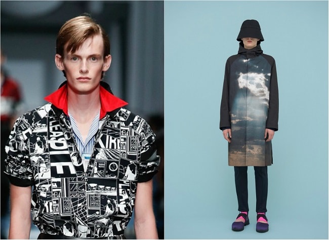
Isn’t this a retreat of last year’s placement print? In a sense, yes, but like many reimagined concepts this year, it’s been given a more mature, sophisticated edge. Away from graphic prints and general randomness, designers have kept it cryptic with collage-like combinations or overtly reference streetwear with graffiti imagery. And, don’t discount the value of pop art: Comic strip-style efforts by Prada and Topman fuse the frenetic-ness of A-Ha’s 'Take on Me' video with the tonal qualities of an Andy Warhol print.

Trending
2
3
4
5
6
7
8
9
10


