1
HOME > Trends >
MUST-WEAR MENSWEAR COLOURS FOR SS18
BE PREPARED TO WEAR AND SEE THESE SHADES
Written by Ivan Yaskey in Trends on the 26th April 2018
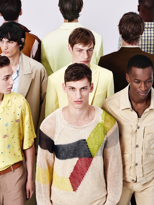
At this point last year, menswear reached an almost unsettling dichotomy. On one hand, a push for neutrals and muted tones revived earthy, occasionally military-influenced shades, like olive and forest green, browns, and even understated yellow-green hues. As a contrast, dance music’s influence made its ubiquitous presence known in more underhanded ways – mainly, a shift toward orange, bubblegum-tinged Millennial pink, and bold purple. For SS18, the wall has partially come down, and we’ve reached a truce, of sorts, between the two extremes. Yet, remnants remain, and as the spring season officially begins, be prepared to wear – or at least see – some combination of the following.
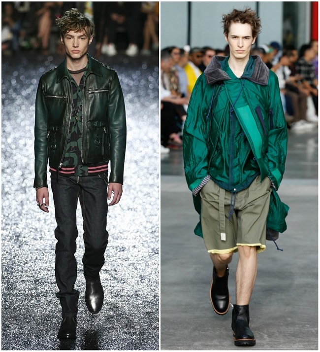
Emerald Green
Why so simple? The fact is, green has returned in middle-of-the-road terms. But, that doesn’t necessarily imply blandness. Instead, through solid and colour-blocked presentations, it neither hints of last year’s forest-influenced hues, nor does it continue the military-inspired colourways we’ve seen. Instead, it’s part turquoise, part emerald, and more saturated than muted. Pantone calls the shade 'Arcadia,' a retro, throwback hue with dark blue undertones hinting at ‘90s sportswear pieces. As such, its blend proves to be a less-uneasy match for red, and fits in with blue, white, or yellow with ease.
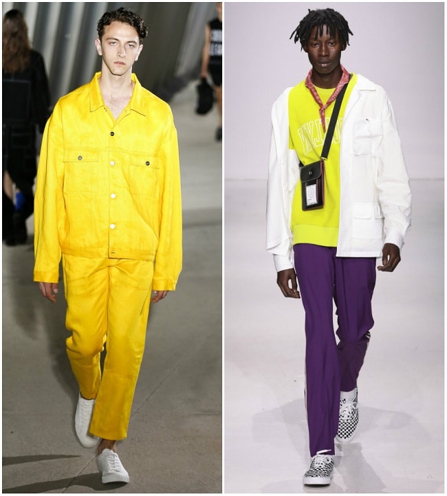
Gold to Neon Yellow
2018 shows we’re not fully afraid of this contentious shade, thought for years as the colour few, if any, men can actually pull off. Yet, Fashion Week presentations indicate a spectrum: mellow yet burning golden hues to full-on, in-your-face neon reminiscent of last year’s rave trend. On one end, you’ve got Pantone’s Meadowlark, brighter and illuminating, and on the other, there’s Lime Punch, an aptly described colour that looks like you’ve been doused with a bottle of Mountain Dew. However you wear it, yellow is always a statement shade, unless, of course, you’re attempting a strictly primary palette look.
Lavender and Lilac
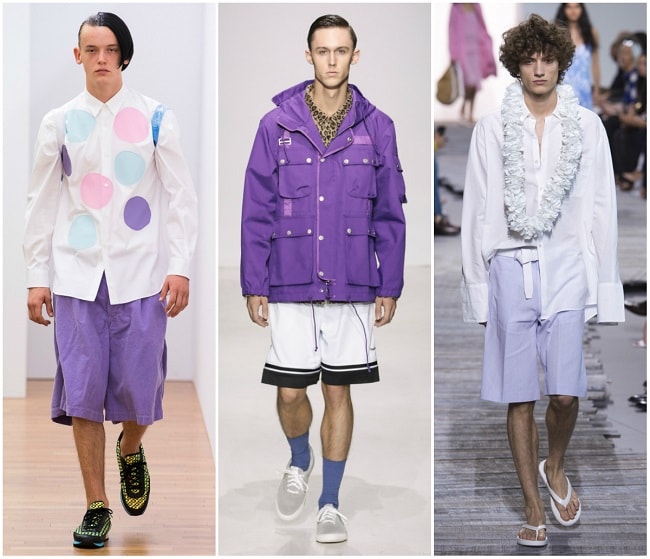
Most would clamor for distinctiveness between the two: One’s softer, and the other has a hint more bluish intensity. Yet, they collectively represent the direction both menswear and fashion in general have taken: away from Millennial Pink. You might say that last year’s dusty rose represented a similar detour, but lavender and lilac take it a step further: More subdued, a stronger, blue-based foundation, and less likely to look like one of Nikki Minaj’s former Barbie wings. Thus, its growing presence represents stylistic maturity: one that retains your character, without resorting outright to strictly neutral tones.
Bright Red
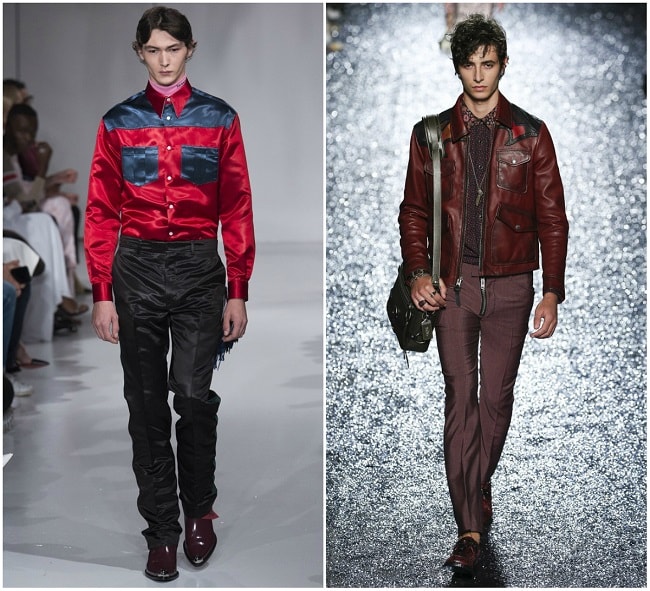
Since blue, in some degree, is a style constant and yellow has a strong presence for SS18, why not finish your primary colour palette with red? Unlike over the past few seasons, red is less dark and smouldering and, instead, has come out into the spotlight. Its bold, bright, and also saturated presence is meant to draw attention and, ideally, is best worn in solid form as an accent shade. Much like yellow, too, red for SS18 covers a spectrum, albeit a smaller one. Cherry Tomato, according to Pantone’s predictions, brings the heat with orange undertones. At the other end, Chilli Oil has a hint of brown that, while it adds some depth, doesn’t detract from the shade’s overall intensity.
Dark Brown
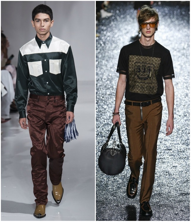
Black’s always going to be your go-to shade for darker, sharper contrasts. But, this season, if you’re looking to soften those distinctions without completely breaking them down, darker brown hues – dubbed 'mocha' and 'Emperador' – create a similar sense of depth. Unlike last year’s ‘70s inspirations, which seemed to directly borrow oranges and browns from the decade’s celluloid, there’s nothing muted or earthy this time around. Instead, rich, intense notes transform what’s essentially a neutral hue into an intentional paradox – something mysterious and shadowy yet strangely vibrant.
Middle-of-the-Road Grey
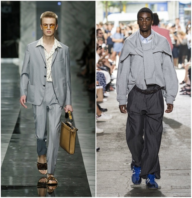
On the subject of neutrals, grey manages to hold its own, and for SS18, its presence quite literally falls right in the middle. Neither subtly dark nor charcoal, the shade called “Harbor Mist” pulls from both and, in the process, hits the sweet spot. Specifically, that’s a shade so far removed from black that you could easily colour-block the two tones, yet dark enough that pairing a white button-down with grey chinos veers away from strictly tonal territory.

Trending
2
3
4
5
6
7
8
9
10


