1
HOME > Trends >
4 WAYS COLOUR-BLOCKING IS NOW COMMONPLACE
RECONSTRUCTED FOR A MODERN AUDIENCE
Written by Ivan Yaskey in Trends on the 3rd October 2017

Any trend’s longevity comes down to two factors: one, the number of seasons it sticks around, and secondly, the point at which it loses its novelty factor and simply blends in. In short, when any element that once seemed innovative is simply here and used like any tool in your style wheelhouse, it has essentially made it. New around the 2011-2012 period, colour-blocking emerged as a ubiquitous, retro-reminiscing concept. At the time, heavy panelling juxtaposing bold, sometimes neon shades harked back to the late ‘80s and early ‘90s, but since then, designers have reconstructed it for a modern audience. As such, colour-blocking has shed its shock value and, instead, has integrated itself through the following methods:
Athleticwear and Athleisure
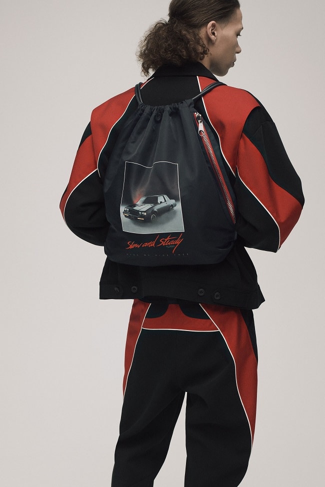
Performance wise, whatever you wear to the gym typically should let your body move, help control sweat through some combination of moisture-wicking and breathable materials, and neutralise odours with an antimicrobial treatment. Come autumn, some sort of insulating or heat-retention factor gets thrown into the mix. However, what separates cut-and-dry athleticwear from athleisure frequently boils down to style. These days, that’s colour-blocking on its own or tossed with a print. Amongst contrasting elements, panelling, geometric accents, and pattern blending, your garment does double duty. Yes, it handles whatever your activity level demands, but it further functions as streetwear, feeling comfortable and looking visually sharp whenever you’re out and about. Essentially, while a classic Champion sweatshirt goes unnoticed with its all-over heather grey, colour-blocking bumps up this leisure and active staple into a statement piece.

A New Way
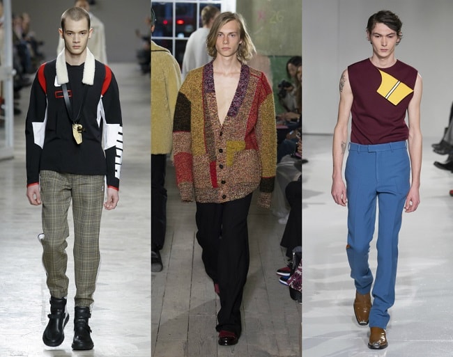
Playing large swaths of red off equally vast sections of blue, and tossing black in for good measure? What appeared inventive back in 2012 now feels like picking items off a menu. Sure, they might not seem to blend well at first, but someone will manage to make sense out of it. Hence, you’ve got Instagrammers posting shots of themselves in layered pastel pink, green, and orange. So, while seeing three dissimilar shades together doesn’t appear as jarring as it used to, designers through all echelons have found ways to push boundaries. It’s fairly mundane to spot a patterned tee, for instance, overlaying an Aztec-style print with colour-blocked horizontal stripes. Or, with an athletic influence, to come across one adding sharp panelling and a contrast pocket to a baseball silhouette. Beyond what’s turned into an everyday staple, colour-blocked denim fuses tonal and textural elements, all while appearing as if someone pieced bits of fabric together. At once, such garments seem familiar but completely break away from assumptions. Specifically, finding new ways to cut up and juxtapose it, reworks what could’ve become a tired trend.

Three or More
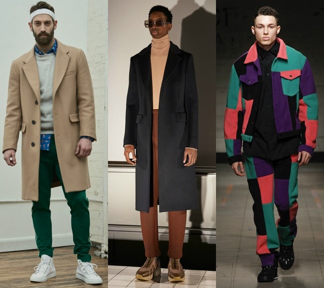
Most of a certain age, when getting told to dress well, were given the advice: “Never wear more than two colours in the same outfit.” For years, following that entailed putting on a solid-colour suit – black, usually – with a lighter-shade shirt. Or, perhaps for something more daring, you swapped out that interchangeable shirt blue for one with a pattern or added a statement print tie. Finishing it off, black shoes never broke boundaries. After all, who laces up brown wing-tip boots when you’ve got a black suit on? Over the past few years, unless you’ve spent your time in the most formal of settings, these decade-held rules have been bent or tossed outright. In business-casual environments, for instance, seeing a coworker show up in an unstructured blazer that doesn’t precisely match his button-down shirt and flat-front trousers isn’t a cause for concern. Similarly, casual ensembles don’t just cover these bases but further contort them with a print or two.

Contrasts by Default
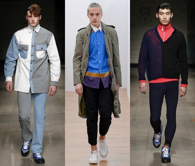
That camp collar shirt with piping around the edges? The button-down shirt with darker cuffs and a collar? The large-scale geometric elements stretching down the side of a plain cotton T-shirt? By this point, each of these instances feels mundane and not noteworthy. After all, why settle on something solid-coloured, when a contrasting border improves it with a pop? In general, we’ve realised that dressing well partially hinges on the interplay between shades – especially when a small quantity can do so much. Although there’s a time and a place for monochrome and the classics, understanding not just what to do with colour but further utilising it inventively pushes you a few steps ahead.

Trending
2
3
4
5
6
7
8
9
10


