1
HOME > Trends >
HOW TO WEAR PALE PINK MENSWEAR
THE DESIGNERS THAT DO THE TREND WELL
Written by Ivan Yaskey in Trends on the 20th June 2017
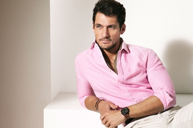
If recent seasons are any indication, colours have circled back around to masculine archetypes. Olive drab, reminiscent of military uniforms, embodies the aggressive rigidness of someone heading out to battle, solid black has the type of mysteriousness that’s omnipresent but never totally open, and navy emerges with a stern, nautical influence. Yet, for Spring/Summer 2017 and subsequent Autumn/Winter collections, one shade subverts it all with a dusty, understated character that’s neither fully feminine nor heavily masculine.
Sitting somewhere in that androgynous middle is a shade Pantone has dubbed Pale Dogwood. One of the top 10 shades seen on the runway this season, it follows in the footsteps of last year’s Rose Quartz, a shade they aptly describe as “candy floss.” But, if Rose Quartz is specifically associated with sweets and seems more like the colour the media calls “Millennial Pink,” where does that leave Pale Dogwood? In spite of its implications, it exudes more of a tranquil, subtle vibe that’s neither in-your-face nor as low-key as off-white. If it were to embody a type of personality, it’s the soft-spoken man you regularly notice but know little about.
As another return to form, Pale Dogwood’s emergence in menswear collections hints at pink’s pre-20th century significance – that the colour was once reserved for men. In line, perhaps indirectly, with this notion, brands trying out this shade have taken a more masculine perspective – one that treats it like any other colour, rather than spin it in a predictably feminine novelty direction.
Streetwear
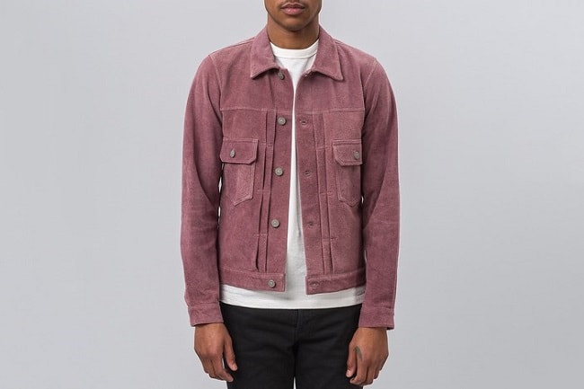
Particularly for American streetwear brands, the three key tenants, transcendent of season, go along the lines of: Strive for a monochrome ensemble, throw a logo on it, and put together a few limited-edition collaborations per year. In all three, pale pink’s managed to have a presence. Adhering to the first of these principles, Visvim splashed the dusty rose shade across its 101 suede jacket, a piece styled like workwear. Although simple at a glance, its fusion is a push-pull scenario between the masculine and the feminine: One clearly expressing its rugged side, and the other infusing it with something gentler.
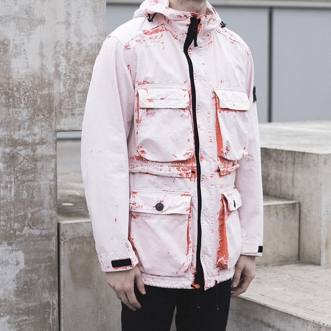
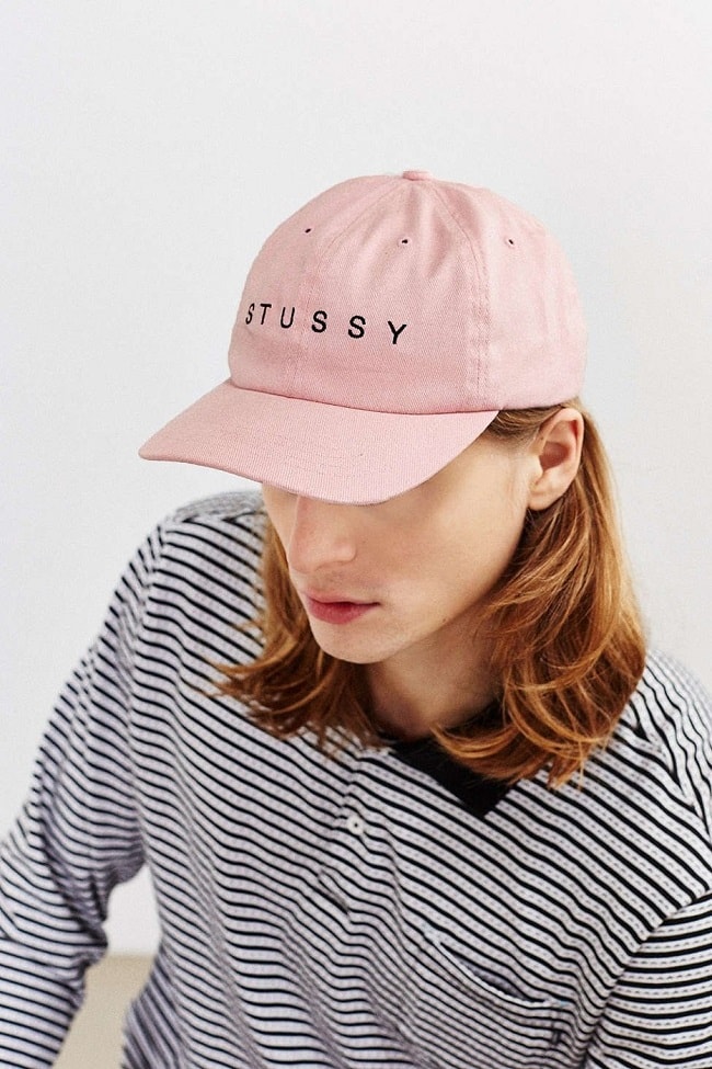
Less about symbolism and more about what streetwear brands do best, Stussy adds the faded bubblegum shade to one of its strapback caps. Less obvious, Ovadia & Sons strayed away from the logo-based design, but applied the light pink colour with a shimmering finish to a souvenir jacket seen at its July 2016 New York Fashion Week show. Nothing’s complicated in either instance – just a different take on a staple piece – and that’s kind of the point. Yet, solid isn’t the only way streetwear has been taking on this trend. Stone Island, for example, reaches an intersection with its Hand Corrosion Parka. Sure, it’s a pink variation, but its construction involves military influences, a bleached aged finish, tech elements, and a classic sportswear silhouette that just happens to be practical.
Trainers
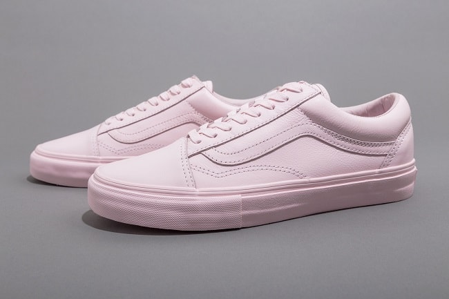
Expanding more on the streetwear concepts listed above, several trainer collaborations have managed to introduce a light or rose pink variation. Perhaps the simplest, the Opening Ceremony x Vans collaboration utilised the latter’s Old Skool low-top silhouette, added a luxurious polished leather upper, and unveiled a solid pink version that, even for all of its supposed low-key character, is going to look bold wherever you end up – after all, how often do you see pastels at the skate park? Taking it up a notch, the Nike SB Zoom Bruin added in a few contrasts – but nothing out of the ordinary. Playing off a colour hinting at mid-century Americana, a black Swoosh cuts through the side, and the vulcanised outsole remains a solid white shade. The Gosha Rubchinskiy x Vans Era Decon LX goes down a similar path, clashing a bright pink top against a black-trimmed outsole.
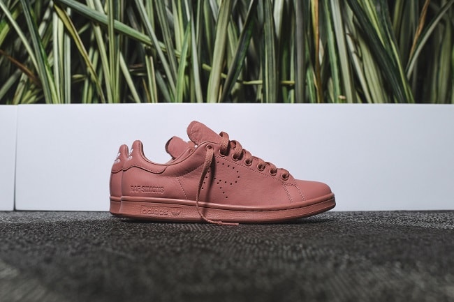
For something darker but bolder, be sure to keep the Raf Simons X Adidas Originals collaboration on your radar. The now-ubiquitous Stan Smith silhouette brings together elements from both brands, and in giving you that edge above all hypebeasts, a deeper pink hue covers everything – outsole through laces – with only a white logo on the tongue breaking up the monotony.
High-Fashion Collections
Louis Vuitton’s SS16 collection, including an embroidered Cuban collared shirt, essentially posed the question, “Is pale pink a pop of colour, or a neutral shade?” In response, a handful of SS17 offerings searched for its appropriate place. Veering full-on toward the former, Sacai’s Clockwork Orange-influenced sportwear pieces utilised it for the shock value, incorporating it in solid form or as an accent through coats and cropped pants. Also viewing lavender in much the same light, the pieces flipped the concept of wallpaper-like pastels on its head, giving them more of an aggressive quality.
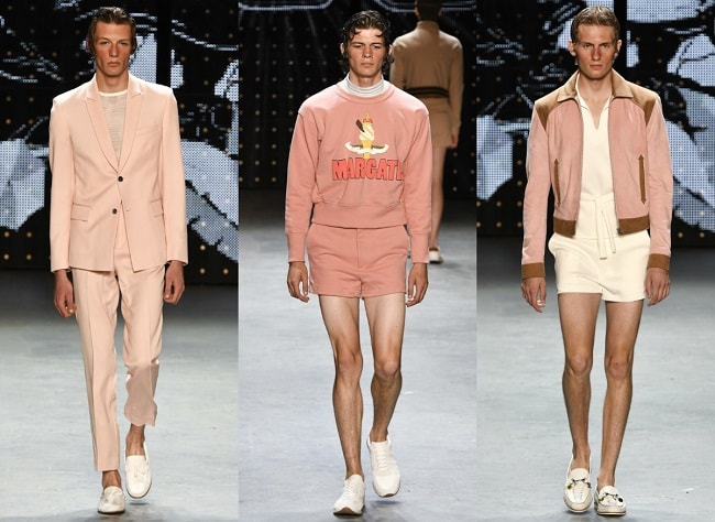
Gucci’s SS17 line further utilised the colour’s impact to accent its dandy-meets-Mod theme. On the runway, Alessandro Michele appears to envision it as component of a three-part colour-blocking scheme, pairing it against other pastels. When not a solid shade saturating a pair of trousers or a blazer, however, it surfaces as one of several colours composing a floral print reminiscent of vintage paisley. But, what about everyday wear? Topman Design SS17 collection has that covered. Using British Seaside as a foundation, the line itself runs the gamut of casualwear – shorts and sweatshirts, unstructured single-button jackets, tracksuits, and bombers – and adds a pink-hued iteration for each. Out of all examples, a nonchalant outlook, here, makes pale pink less of an oddity and more of a variation on any neutral – just like men have been wearing burgundy or olive green over the past few seasons.

Trending
2
3
4
5
6
7
8
9
10


