1
HOME > New Collections >
WOOYOUNGMI AUTUMN/WINTER 2014
A REVIEW OF THE RECENT PARIS FASHION WEEK SHOW BY MADAME WOO YOUNGMI
Written by Jake Hall in New Collections on the 22nd January 2014

Fashion and art are no strangers from one another, with many designers turning to the art world for inspiration and influence. This tradition continued as Madame Woo looked towards modern museums for inspiration in her Autumn/Winter 2014 collection.
The show’s press release explained the concept of a man present in some of the world’s most iconic contemporary art musems, with both London’s Tate Modern and Bilbao’s Guggeinheim cited as direct references. Gone were the harsh lines and colour-blocking of previous collections, and a new, softer take on the WooYoungMi aesthetic was introduced.
Although the emphasis was still on minimalism, the bold colour palettes were replaced by dark neutrals and the graphic lines were replaced with architectural curves, marking a new direction for the designer.
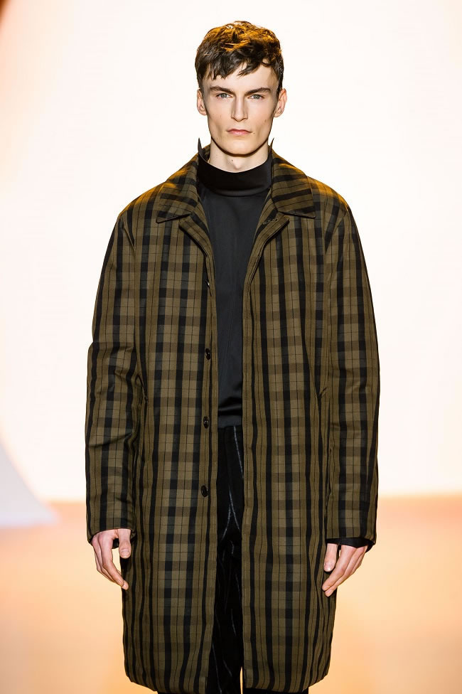
As is the case with most A/W collections, it was the outerwear that truly provided the show’s highlights - in keeping with the elliptical theme, shoulders were rounded to form a range of loosely-worn cocoon coats in muted colours.
Fabric choices were innovative as coats were double-felted in order to add volume and create a circular profile silhouette. Coats also came in cool fabrics such as neoprene, and were seen almost as sculptures in the sense that they provided a makeshift exoskeleton for the models that wore them.
The prints on display also added interest, sticking mainly to a variation of different size checks in charcoal grey and petrol blue.
The show’s definitive aesthetic centred on the trousers, which were re-interpreted with a slightly dropped crotch and a cropped leg, creating a boxy silhouette.
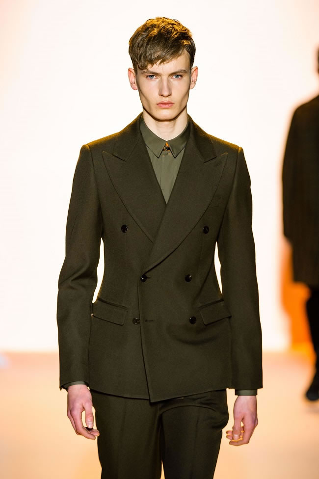
They were the perfect canvas for layering, which was seen in long sweaters teamed with cropped jackets and polished leather boots. The traditional suit jacket was also tackled in the collection, fitted with bonded elliptical panels which jutted out from underneath lapels and replicated the architecture of the Guggenheim.
Casual looks came in the form of black sweatshirts which were emblazoned with circular copper prints and, at one point, what seemed to be a re-imagining of the ‘yin’ and ‘yang’ symbols.
Decorative touches were added with flashes of copper – from decorative necklines through to copper zips, these elements of hardware toughened up classic pieces.
Overall, the collection was impressive both in its clarity of vision and level of execution. There was a nice mix of investment pieces and wardrobe staples, and the curved silhouettes introduced an architectural twist which helped distinguish the show’s aesthetic.
High-tech fabric choices were a sign of innovation, and hint at a promising future for a designer that is mixing minimalism and futurism in a new, interesting way.

Trending
2
3
4
5
6
7
8
9
10


